https://www.instagram.com/p/Bpw9SVjHBIy/
Last Saturday, I cast on for a Mountain Mist sweater by Tin Can Knits, which was released with the Strange Brew collection. I’ve already made a few smaller projects out of the collection (an Anthology hat, a Fleet hat) but took some time to chose a sweater to do. If you’re interested in colorwork, I highly recommend picking this collection up. For $22, you get eight sweater patterns, three hat patterns, a cowl pattern, plus an incredible yoked sweater recipe and a colorwork hat/cowl recipe. Totally more than worth the cost!
The Mountain Mist sweater caught my eye because it’s graphic and modern looking. I decided to knit it in Ístex Léttlopi because it’s the most widely available worsted yarn here in Reykjavík (well, at least within walking distance), but also because I wouldn’t want to have spent a whole season here without making one!
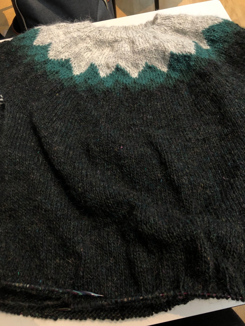
This sweater has a main color (MC) and three contrasting colors (CC1, CC2, CC3). The first contrasting color is around the neck, the second and third are for the smaller “mountains,” and the main color is the third row of “mountains” and the sweater body. At first, I picked a light gray for CC1, a light heather lilac for CC2, a medium bottle green for CC3, and a dark heather green for MC. I knit up the yoke but it quickly became apparent that there wasn’t enough depth contrast between the gray and the lilac. Side by side, they were very hard to tell apart. Additionally, the color story didn’t make sense and the lilac didn’t look good with the bottle green. I wish I had taken photos of the yoke at this point to show what I mean but I hadn’t.
So, I went back to the yarn store and got a medium-dark green somewhat in between the two I already had, and re-knit the yoke with the gray as CC1, the medium bottle green as CC2, the medium-dark green as CC2, and the dark forest green as MC. This is the combination that can be seen in my Instagram story above, and the shades are 0054, 1405, 9423, and 1707.
What’s interesting about my final color choices is that, like between the gray and the lilac, there’s not a ton of depth contrast between the first and second and then the second and third greens, but because there’s a high amount of contrast between the greens and the gray, the top mountain peaks are still obvious. There’s enough contrast between the greens so that, in certain lights, the mountains are visible, but in other lights it looks like a cool gradient.
Ideally, I’d like to have more contrast between all three to emphasize the mountain pattern, but I really like the gradient effect I got with these colors. Most of the lighter greens at the store were yellow- or brown-based, while the other two greens I already had were both more blue-based, so none of them would have looked the way I wanted. I would have settled for a light greenish-blue, but most of the blues were more gray-toned. Overall, I’m really enjoying what’s happening with this sweater.
I’ve gotten past separating for the underarms and am onto the body. That’s the other thing that’s great about Léttlopi, it knits up so fast! The recommended needle for the sweater is a US 8, but I got perfect row and stitch gauge with a US 9, which is so rare for me. I’m hoping to have this sweater done in time to wear it on Christmas!
What are you guys working on? Holiday gifts, or something for yourself?